Categories
Art and Animation Fundamentals

Week 8 Anatomy

Lecture

For this week, we where given the opportunity to learn about human anatomy. There are multiple reasons why human anatomy when drawing characters for games. One of the main reasons why people use human anatomy when drawing characters is because it will make the design more natural and more human.

We learned that to understand and remember the anatomy, we should simplify muscles into basic shapes. I understood the fact that there is five main muscle groups (the chest, abdominals, back, arms and legs). Next thing we learned is about proportions. Proportions help us to decide where the body parts of a human being by conveying lines going left to right, chin being the top to soles or feet at the bottom.

What I already know about proportion anatomy is that age can be applied to it. For example, children have larger heads than adults. This could make the child more cuter that way. Another example, adolescents can have more muscles and a defined body shape. And finally, the elderly have a smaller size and the posture of the character is different from the others.

A new thing I’ve learned within this lecture is that when Gesture Drawing, it’s best to create an action line. Action lines are an imaginary line that you can draw a character’s pose resulting in a character’s body posture flows along this line of action.

What I created

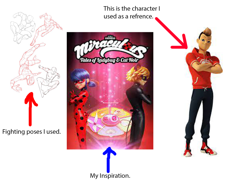
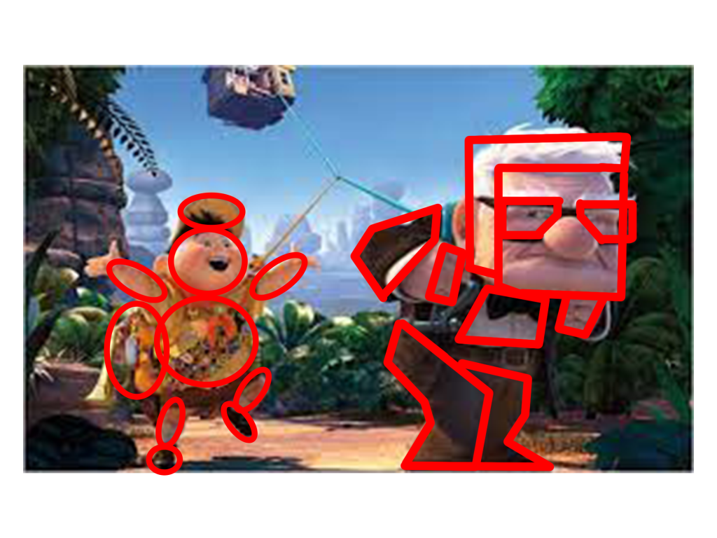
These are the reference drawings I used to help me with the character anatomy. The fighting poses I found in Pinterest. The Inspiration is the picture in the middle, and the character in reference is the picture on the right. I belive that I have skilfully taken the attributes of the the picture on the left (using the hoodie he is wearing, the hair, the trainer shoes and arms) the style of the show/ their posters and have used some of those fighting poses that were shown in the image on the left.

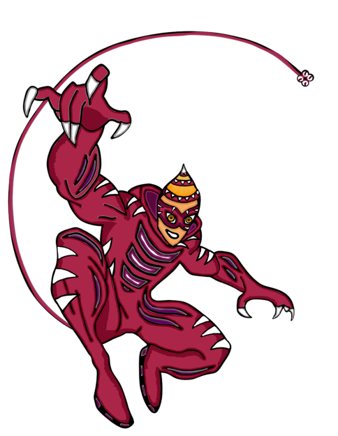
This is currently my best character anatomy drawing I have made so far. I have visited a website called Pinterest (this site helps me find the inspiration and the right fighting poses for the drawing). This design is based of a kid’s show where ordinary people use the power of magic jewels to defeat the evil in the world. The hero I drew is called Jaguar. I named it Jaguar because of the sports car, the animal, the character himself is sporty and is a jock in the high school he attends.

The overall outcome of this image shows that I have understood the basics of character anatomy and use this in my own work.

Categories
Art and Animation Fundamentals

Week 6 Pixel Art

Lecture

For that week, we have received a lecture about pixel art. In the past, I had some experience in creating pixel art and I have always understood that when creating pixel art, we will be always working on powers of two meaning the pixel size depth is always even. For example, 8×8 or 16×16 would be perfect for the pixel size of the canvas to work on.

I also learned that pixel art needs to have a good readability because the tool to draw a pixel on a canvas is already extremely small, the detail is within the shape of the object or character. I found out that the reason why people uses a colour pallet when making pixel art, is because it helps to keep a focussed colour scheme and avoid the art from being packed with lots of colours.

Something I didn’t know about was a technique called dithering. Dithering is shading to make something look lighter or darker. This is mainly used in backgrounds (if you want to have a nice shady sky). This also makes the game more visually impressive and create a retro style theme within the image.

I also understood the fact that to add shading within a pixel art, you need to think about lighting and shadow. Those include directional light, highlights, reflection, rim light, bounce light and shadow. Directional light includes lighting at a certain direction. Reflection includes the shine of the texture of the object your drawing. Rim light is light that appears on the edge of a character. Bounce light is when light bounces off an object and landing on the art piece you are drawing. Shadow is anywhere the light doesn’t touch in an art piece.

What I have created

I have used this lecture to create shading into my platformer characters for my platformer game:

The characters have lighting to give them a some texture within the drawing. Also the reason why the picture is slightly fuzzy because originally the picture is soo small (16×16). Overall, I have enjoyed taking part in the pixel art lecture and have learned a lot in that lecture and gaining knowledge on designing using pixel art.

Categories
Art and Animation Fundamentals

Week 5 Colour & Shape Theory

Lecture

For this week, we where given a lecture about Shape and colour theory. This lecture was very interesting and I had the opportunity to learn about the looks and style of character design and other object design. I love how when we look at a shape most people get similar views on what we feel about it. For example when I look at a triangle, I get the feeling of danger and sharpness and most people think the same.

The next thing we learned is that shape theory can be applied to characters. Examples include the characters in Up, Russel the kid camper and Carl the grumpy elderly. Russel’s character has smooth soft circles everywhere on his character (this means the character’s personality is soft and harmless and he is in the film). Carl however, has a lot of sharp shapes and squares on his character (this means the character is sturdy, strong but supportive and he is in the film).

The third thing I have learned about is silhouettes. Also how perception of a character (mainly) can change depending on the shapes used on that character. I have also learned that putting too many shapes on an object or character can over complicate the design resulting in loosing focus.

The fourth thing I have learned with the help of this lecture is colour psychology. I have learned that different colours have different meanings. Big companies use certain colours on their logos to convey emotion, meaning or style. An example of a logo is the Fanta logo has the colour orange and it signifies friendliness and confidence. Fanta is a soda drinks company that is favored by most people.

What I have created

After the lecture, we where given a task to create our own sprites for our top down shooter game using what we learned on shape and colour theory. I used photoshop to create my designs and colour pallets and resulted on making my sprites for the game.

Overall, I have learned a lot about shape and colour theory that I plan to use the knowledge I have gathered and will use it for my future designs. making characters such as villains I will add certain assets that makes it look dangerous, for protagonists I will make them look more smoother and easily approachable.

Categories
Art and Animation Fundamentals

Week 4 Perspective

Lecture

For this week, I have attended a lecture and learned about different types of perspectives used within level design and other objects. The lecturer also talked about Isometric and Orthographic drawing and other Compositional techniques. I have learned that one point perspective allows you create a scene with a vanishing point on the horizon. Isometric drawings are functional also having parallel projection and their vanishing points are infinitely far.

Orthographic drawings are mainly of objects top/bottom, front/back, left and right. This allows for more accuracy in creating 3D objects. Two point perspective is a type that contains two vanishing points this is often used for object being viewed from a corner. Three point perspective has three vanishing points just like two and one point perspective, you have two on the horizon line but with an additional vanishing point. As a result, this creates a realistic feeling of depth. Furthermore, we learned about focal points. For example, what the person (seeing the image) finds appealing by using size shape and colour.

During this lecture, I have understood the fact that perspective drawing is just as important for the scenery of a game because it can tell a story within a part of a scene of a game, make the viewer focussing the attention on certain things in a picture and create a visually appealing image. An example of that:

In this picture, our attention is focused on the hunter on the horse and the hider. This is due to the focal points of interest in this picture. Furthermore, the rule of thirds in this image also makes it more appealing. We see the hunter the log and the hider. Perspective drawing is very important and useful for most things in game design for example, creating 3D models on paper by drawing multiple different sides of an object, top, bottom, front, back, left, right. This can create an accurate view of an object.

Weekly Challenge

The Weekly challenge was to create something using one of the many perspectives talked about above.

Overall, I have learned that perspective drawing can create a better understanding to anyone who wants to create scenes, objects and characters within a game. I have also learned that with the use of perspective drawing when drawing scenery creates some depth within the drawing.

Categories
Art and Animation Fundamentals

Week 3 UI Design.

Lecture

During that week I was given an opportunity to learn about UI design. The Lecture taught me that UI design is just as important as the game it self because it provides a useful amount of information to the person playing the game. The game UI may have guides, game info, object info and others. We where also shown examples of good UI design and bad UI design. Some can be seen as simple, and some can go to the upmost extreme.

Examples of good UI:

Examples of bad UI:

When I first saw the difference I understood the reason why the bad UI design isn’t the best. It had too many colours everything is on screen at once and some of text isn’t legible. I have also learned when making the UI, the eye feels comfortable when looking at certain matching colours. However, the good UI design shows slickness and simplicity. Furthermore, it looks more tidy and nice to look at.

Those matching colours include, Monochromatic (one colour), Complementary (Two colours that are on the opposite side of the colour wheel), Split-Complimentary (Three colours that include a base colour and two secondary colours on the opposite sides of the colour wheel), Triad (Three colours that are evenly spaced on the colour wheel), Tetradic (Four colours that are on equal sides of the colour wheel) and last but not least the Analogous (A group of colours that have similarities).

What I learned

With the help of this lecture, I managed to use what I have learned and used it to create a UI for some of my game prototypes. The one on the right had some photoshop work put into the game, the one on the left got its design and looks from Unity.

I have learned that the UI can make a game look more impressive. Overall, this week was enjoyable, I have learned a lot about game UI and will plan to take in that knowledge when I make my own game.

Categories
Game Design and Prototypes

Week 6 Platformer Game.

This is my game: https://sair-strike.itch.io/pumpkin-dash

For this week, I was given a Task to create a Platformer Game where I will create a character that will venture a map full of enemies and hazards that will challenge the player to hop and run across platforms to reach a goal. I have followed a step by step guide on how to create the platformer game.

Those videos helped me understand making the game. I enjoyed the production process. I have created a bunch of scripts for this game and have followed the videos to the point and have successfully made a fully functional game.

I did have some issues with the kill enemy script where when I stomp on the enemy using the player, it destroys the enemy. I created the script and everything is correct from a grammar standpoint but for some reason the script just simply wouldn’t do the function. The solution to this issue is a tick box I need to enable in order for the script to work. I have learned that some difficult issues have the simplest answers when producing a game on unity.

I have created a bunch of sprites for my game on photoshop. I made the protagonist, enemy, hazard, platform blocks and grabbed a sign clipart and have implemented that into my game.

With those assets I have crafted a nice but medium level obstacle course that teaches the player mechanics of the game to anyone who plays the game on their devices. I added sections where the player can’t advance unless they learn the mechanics like a double jump wall, where the player has to double jump to get to the next section.

When I went through the production of the game and have made a fully functional game. I felt that the game needed more functionality for example, it needed a “You died press the mouse button to try again” button to allow the player to play again if the player has died. Also I have added sounds into my project. Background music to keep the player engaged with the game and a sound that emits when you destroy the enemy.

I have posted the game onto Itch.io and have published the game so anyone who has a laptop or a desktop computer can play. The game is called Pumpkin Dash and I am very proud of my self on the outcome of the game and have learned how to implement music into my game.

Categories
Game Design and Prototypes

Week 5 Top down Shooter.

This is my game: https://sair-strike.itch.io/cloaks-of-the-deceitful

For this Week, I was given a task to make a top down shooter game where I used videos as guidance for the making of the game. I like following the videos in step by step order because it visually shows me what I needed to do.

Those videos helped me to create the game. With little issues, I managed to make a game with my own twist in the aesthetics of the game. I followed every video to the point. When creating the characters, enemies and the projectiles, I used photoshop. I had a good time creating the characters.

The theme for my Top down shooter is a child being left at a haunted theatre by his careless parents and what haunts the child is floating masks that resemble the Muse Masks of tragedy and comedy. When creating the scripts for the game I followed the video to the point and went back multiple times in case I accidently miss anything. I did have some struggles, examples mainly include misspelling within the codes resulting in the code not being able to work.

In this project, I have created twelve different scripts with various functions. Those functions include enemy movement and behaviour, player movement and behaviour, bullet movement and behaviour and other functions and aesthetics. I felt I have put more effort and work into this project than anything ells. Which I am proud at.

I did have an issue where I made a functional script but it wasn’t working for some reason. The solution to that is because the script wasn’t saved properly even though I did save and it might be a bug.

When I finished off the final bits of the game, I was about to post my game on Itch.io. I had some dimensional issues and an issue that involves me in creating a new HTML build and put that file into the exporting box. I am so proud in myself when making the game.

When posting the game online, I had to make a nice looking thumbnail for my game and this was what I created:

This thumbnail portrays what happens in the game by showing the two villains chasing the hero. The Smiley is catching up because it’s faster in game. Overall I really enjoyed making the game and I have received feedback including the explosion for the enemy fits a big part of the screen and the how to play part of the game isn’t specified resulting in me saying how to move or shoot. I felt that did very well in this game and learned some new things too.