Lecture
During that week I was given an opportunity to learn about UI design. The Lecture taught me that UI design is just as important as the game it self because it provides a useful amount of information to the person playing the game. The game UI may have guides, game info, object info and others. We where also shown examples of good UI design and bad UI design. Some can be seen as simple, and some can go to the upmost extreme.
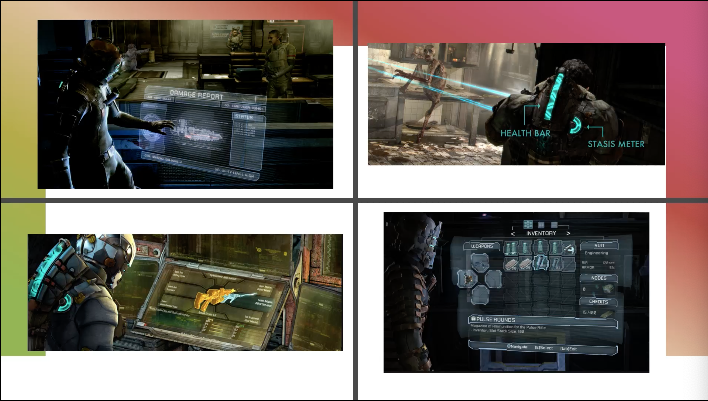
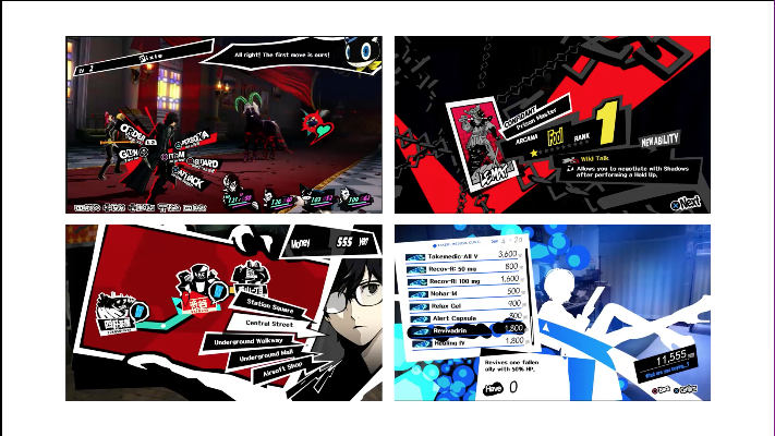
Examples of good UI:
Examples of bad UI:

When I first saw the difference I understood the reason why the bad UI design isn’t the best. It had too many colours everything is on screen at once and some of text isn’t legible. I have also learned when making the UI, the eye feels comfortable when looking at certain matching colours. However, the good UI design shows slickness and simplicity. Furthermore, it looks more tidy and nice to look at.
Those matching colours include, Monochromatic (one colour), Complementary (Two colours that are on the opposite side of the colour wheel), Split-Complimentary (Three colours that include a base colour and two secondary colours on the opposite sides of the colour wheel), Triad (Three colours that are evenly spaced on the colour wheel), Tetradic (Four colours that are on equal sides of the colour wheel) and last but not least the Analogous (A group of colours that have similarities).
What I learned
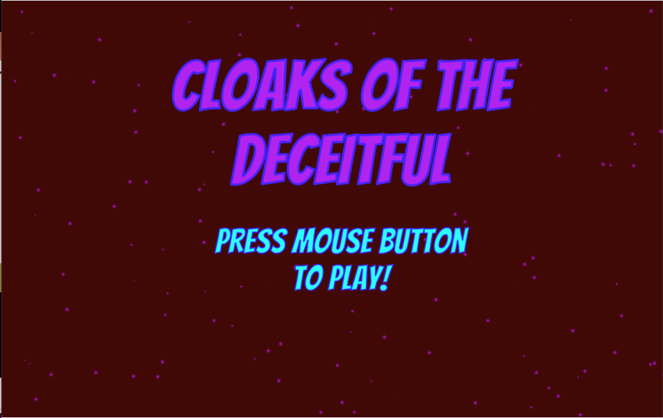
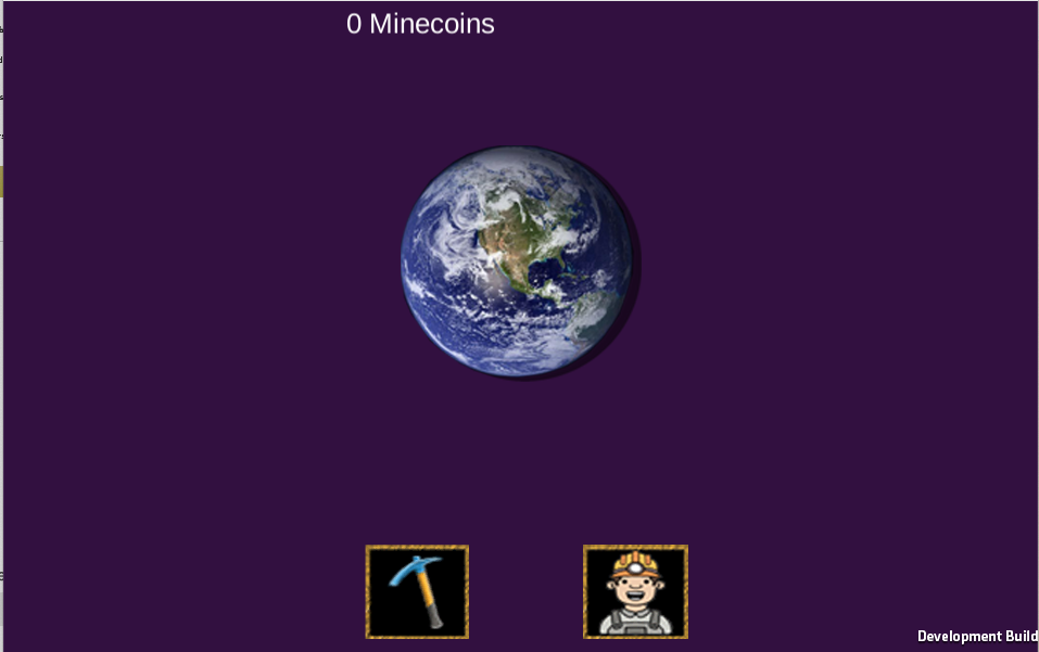
With the help of this lecture, I managed to use what I have learned and used it to create a UI for some of my game prototypes. The one on the right had some photoshop work put into the game, the one on the left got its design and looks from Unity.
I have learned that the UI can make a game look more impressive. Overall, this week was enjoyable, I have learned a lot about game UI and will plan to take in that knowledge when I make my own game.