Categories
Art and Animation Fundamentals

Week 10 Principles of Animation part 2

Lecture

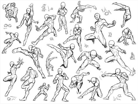
For that week, we were given an opportunity to learn about bone rigging and animation. I found this lesson very interesting and I wanted to know more about this type of animation because I like to learn how to animate and experiment with new functions I’ve yet to learn. From the last session, I have learned about pose to pose animation, squash and stretch animation, follow through, overlapping action and staging.

Next we then learn about other animation styles. One of them includes arcs. Arcs allow you to get natural fluid movement. This is affected by gravity, drag and mass. A second animation style is called secondary action. Secondary actions is used to compliment the primary action. For example on a character it would be the head, face, arms and hands.

I also know that there is something within animation called a slow in, slow out (this is when movement starts slowly and ends slowly.) because no living object instantly reaches top speed and stops at is lowest speed instantly. Furthermore, I know that timing relates with how many drawings in the animation the more drawings within an overlap animation the slower the animation and less overlapping drawings the faster the animation.

The third thing we learned is solid drawing. When creating solid drawings, weight, balance, and volume are applied to achieve a better drawing style. Also I have learned that it’s best to avoid twinning in most of the character design because it can make the character feel less life-like. Twinning is when you make a character symmetrical in its pose. Giving different straights and curves can make your character designs organic and realistic.

What I learned

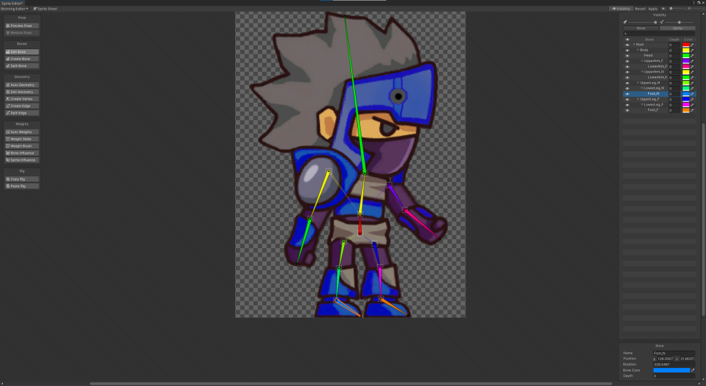
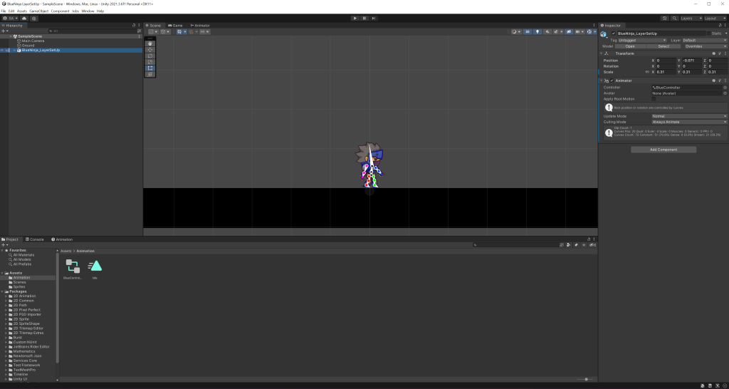
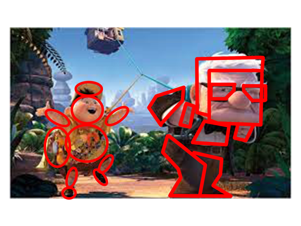
For that week’s lab session, I learned how to create and have experimented with bone rigging. I have received a sprite atlas and a full character sprite from canvas for the bone rigging to work.

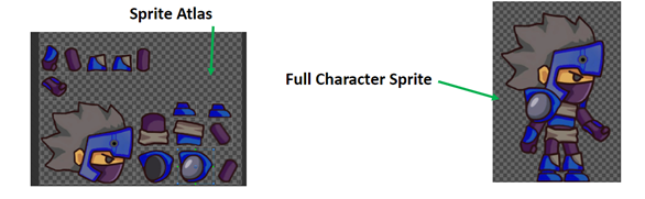
I have followed a detailed guide for the bone rigging prosses. I learned how to apply bones to the sprite. It was a very interesting and fun prosses also experimenting with the movement of the character and creating milestones on a timeline. When you play the timeline the character moves if you marked the movement on the timeline. Overall I have learned how to rig bones onto character sprites, had fun with experimenting with the new features. I will also implement those techniques onto my future games.

Categories
Art and Animation Fundamentals

Week 9 Principles of Animation Part 1.

Lecture

For that week, we were given the opportunity to learn about sprite sheet animations. With the help of those sprite sheets, we could create a basic idea of what our game characters/ environmental designs look like in a retro style game.

Within the lecture session, we had a reminder that there are four types of animation. Cell animation, 2D Animation, 3D Animation and stop motion animation. Cell animation is mainly used for cartoon tv show mainly used in superhero or Si-Fi genre type shows. What I have learned during this lecture, is during a Pose to Pose animation there is such thing as keys, extremes, breakdowns and in-betweens. These pose drawings can map out the animation and create a smooth transition from one pose to another in this case from left to right.

What I already learned when it comes to 2D animation, is that it will always be in a flip book style meaning you must create an overlap of images to create a smooth transition animation within a scene. Also, I know that the animation can differ in speed depends on how far or close the singular images are together. If the the images are far apart from each other, the object is moving faster and if the images a closer together that means the object is moving slower.

What I have created

I have created my own classy, funny character sprite sheet where you see the character’s idle animation, walk animation and jump animation. The process was difficult because the character I created looks like a bunch of lines and creating the jump sprites for it was complicated.

Overall, I like creating character sprites in that lab session. And I learnt a few new things and hopefully use this knowledge for my future work.

Categories
Art and Animation Fundamentals

Week 8 Anatomy

Lecture

For this week, we where given the opportunity to learn about human anatomy. There are multiple reasons why human anatomy when drawing characters for games. One of the main reasons why people use human anatomy when drawing characters is because it will make the design more natural and more human.

We learned that to understand and remember the anatomy, we should simplify muscles into basic shapes. I understood the fact that there is five main muscle groups (the chest, abdominals, back, arms and legs). Next thing we learned is about proportions. Proportions help us to decide where the body parts of a human being by conveying lines going left to right, chin being the top to soles or feet at the bottom.

What I already know about proportion anatomy is that age can be applied to it. For example, children have larger heads than adults. This could make the child more cuter that way. Another example, adolescents can have more muscles and a defined body shape. And finally, the elderly have a smaller size and the posture of the character is different from the others.

A new thing I’ve learned within this lecture is that when Gesture Drawing, it’s best to create an action line. Action lines are an imaginary line that you can draw a character’s pose resulting in a character’s body posture flows along this line of action.

What I created

These are the reference drawings I used to help me with the character anatomy. The fighting poses I found in Pinterest. The Inspiration is the picture in the middle, and the character in reference is the picture on the right. I belive that I have skilfully taken the attributes of the the picture on the left (using the hoodie he is wearing, the hair, the trainer shoes and arms) the style of the show/ their posters and have used some of those fighting poses that were shown in the image on the left.

This is currently my best character anatomy drawing I have made so far. I have visited a website called Pinterest (this site helps me find the inspiration and the right fighting poses for the drawing). This design is based of a kid’s show where ordinary people use the power of magic jewels to defeat the evil in the world. The hero I drew is called Jaguar. I named it Jaguar because of the sports car, the animal, the character himself is sporty and is a jock in the high school he attends.

The overall outcome of this image shows that I have understood the basics of character anatomy and use this in my own work.

Categories
Art and Animation Fundamentals

Week 6 Pixel Art

Lecture

For that week, we have received a lecture about pixel art. In the past, I had some experience in creating pixel art and I have always understood that when creating pixel art, we will be always working on powers of two meaning the pixel size depth is always even. For example, 8×8 or 16×16 would be perfect for the pixel size of the canvas to work on.

I also learned that pixel art needs to have a good readability because the tool to draw a pixel on a canvas is already extremely small, the detail is within the shape of the object or character. I found out that the reason why people uses a colour pallet when making pixel art, is because it helps to keep a focussed colour scheme and avoid the art from being packed with lots of colours.

Something I didn’t know about was a technique called dithering. Dithering is shading to make something look lighter or darker. This is mainly used in backgrounds (if you want to have a nice shady sky). This also makes the game more visually impressive and create a retro style theme within the image.

I also understood the fact that to add shading within a pixel art, you need to think about lighting and shadow. Those include directional light, highlights, reflection, rim light, bounce light and shadow. Directional light includes lighting at a certain direction. Reflection includes the shine of the texture of the object your drawing. Rim light is light that appears on the edge of a character. Bounce light is when light bounces off an object and landing on the art piece you are drawing. Shadow is anywhere the light doesn’t touch in an art piece.

What I have created

I have used this lecture to create shading into my platformer characters for my platformer game:

The characters have lighting to give them a some texture within the drawing. Also the reason why the picture is slightly fuzzy because originally the picture is soo small (16×16). Overall, I have enjoyed taking part in the pixel art lecture and have learned a lot in that lecture and gaining knowledge on designing using pixel art.

Categories
Art and Animation Fundamentals

Week 5 Colour & Shape Theory

Lecture

For this week, we where given a lecture about Shape and colour theory. This lecture was very interesting and I had the opportunity to learn about the looks and style of character design and other object design. I love how when we look at a shape most people get similar views on what we feel about it. For example when I look at a triangle, I get the feeling of danger and sharpness and most people think the same.

The next thing we learned is that shape theory can be applied to characters. Examples include the characters in Up, Russel the kid camper and Carl the grumpy elderly. Russel’s character has smooth soft circles everywhere on his character (this means the character’s personality is soft and harmless and he is in the film). Carl however, has a lot of sharp shapes and squares on his character (this means the character is sturdy, strong but supportive and he is in the film).

The third thing I have learned about is silhouettes. Also how perception of a character (mainly) can change depending on the shapes used on that character. I have also learned that putting too many shapes on an object or character can over complicate the design resulting in loosing focus.

The fourth thing I have learned with the help of this lecture is colour psychology. I have learned that different colours have different meanings. Big companies use certain colours on their logos to convey emotion, meaning or style. An example of a logo is the Fanta logo has the colour orange and it signifies friendliness and confidence. Fanta is a soda drinks company that is favored by most people.

What I have created

After the lecture, we where given a task to create our own sprites for our top down shooter game using what we learned on shape and colour theory. I used photoshop to create my designs and colour pallets and resulted on making my sprites for the game.

Overall, I have learned a lot about shape and colour theory that I plan to use the knowledge I have gathered and will use it for my future designs. making characters such as villains I will add certain assets that makes it look dangerous, for protagonists I will make them look more smoother and easily approachable.

Categories
Art and Animation Fundamentals

Week 4 Perspective

Lecture

For this week, I have attended a lecture and learned about different types of perspectives used within level design and other objects. The lecturer also talked about Isometric and Orthographic drawing and other Compositional techniques. I have learned that one point perspective allows you create a scene with a vanishing point on the horizon. Isometric drawings are functional also having parallel projection and their vanishing points are infinitely far.

Orthographic drawings are mainly of objects top/bottom, front/back, left and right. This allows for more accuracy in creating 3D objects. Two point perspective is a type that contains two vanishing points this is often used for object being viewed from a corner. Three point perspective has three vanishing points just like two and one point perspective, you have two on the horizon line but with an additional vanishing point. As a result, this creates a realistic feeling of depth. Furthermore, we learned about focal points. For example, what the person (seeing the image) finds appealing by using size shape and colour.

During this lecture, I have understood the fact that perspective drawing is just as important for the scenery of a game because it can tell a story within a part of a scene of a game, make the viewer focussing the attention on certain things in a picture and create a visually appealing image. An example of that:

In this picture, our attention is focused on the hunter on the horse and the hider. This is due to the focal points of interest in this picture. Furthermore, the rule of thirds in this image also makes it more appealing. We see the hunter the log and the hider. Perspective drawing is very important and useful for most things in game design for example, creating 3D models on paper by drawing multiple different sides of an object, top, bottom, front, back, left, right. This can create an accurate view of an object.

Weekly Challenge

The Weekly challenge was to create something using one of the many perspectives talked about above.

Overall, I have learned that perspective drawing can create a better understanding to anyone who wants to create scenes, objects and characters within a game. I have also learned that with the use of perspective drawing when drawing scenery creates some depth within the drawing.

Categories
Art and Animation Fundamentals

Week 3 UI Design.

Lecture

During that week I was given an opportunity to learn about UI design. The Lecture taught me that UI design is just as important as the game it self because it provides a useful amount of information to the person playing the game. The game UI may have guides, game info, object info and others. We where also shown examples of good UI design and bad UI design. Some can be seen as simple, and some can go to the upmost extreme.

Examples of good UI:

Examples of bad UI:

When I first saw the difference I understood the reason why the bad UI design isn’t the best. It had too many colours everything is on screen at once and some of text isn’t legible. I have also learned when making the UI, the eye feels comfortable when looking at certain matching colours. However, the good UI design shows slickness and simplicity. Furthermore, it looks more tidy and nice to look at.

Those matching colours include, Monochromatic (one colour), Complementary (Two colours that are on the opposite side of the colour wheel), Split-Complimentary (Three colours that include a base colour and two secondary colours on the opposite sides of the colour wheel), Triad (Three colours that are evenly spaced on the colour wheel), Tetradic (Four colours that are on equal sides of the colour wheel) and last but not least the Analogous (A group of colours that have similarities).

What I learned

With the help of this lecture, I managed to use what I have learned and used it to create a UI for some of my game prototypes. The one on the right had some photoshop work put into the game, the one on the left got its design and looks from Unity.

I have learned that the UI can make a game look more impressive. Overall, this week was enjoyable, I have learned a lot about game UI and will plan to take in that knowledge when I make my own game.

Categories
Art and Animation Fundamentals

Week 2 Photo Manipulation

Weekly Challenge

For that week’s weekly challenge I was tasked to make a happy image look more gloomy or scary, or vice-versa. I wanted to change the happy into a gloomy by making it look strange by adding new images in the picture when in reality, those items are not there. I am basing my ideas on a game called I’m on observation duty where the player is given a task to monitor cameras in a local setting to find anomalous events happening on the cameras. Those anomalies include added objects, moving objects, ghosts and even intruders. I added items that fit in that specific scenery. The setting I went for is a farm setting. Originally, the image is happy and sunny but I turned it gloomy.

This is the original picture:

For this picture, I used my Photoshop knowledge to edit. I use techniques like desaturating the picture and making it look grainy and wet similar to what happens on a rainy day. Those are the images are listed below:

I also used basic photoshop shapes to create a make shift scarecrow that will be hidden within the image. I used the filter tools to create a rainy texture. I have used my knowledge of photoshop to make an image look completely different by using basic tools like the hue-saturation tools and the filter tools. This is what the image looks like after I edited it:

Categories
Art and Animation Fundamentals

Week 2 Photo Bashing

Lecture

In week 2, I was given a task during my lecture to learn and create an artwork that has the technique of photo bashing. Photo Bashing is a style people use to create concept art and can be used as inspiration for the creation of games, films and other media.

Weekly challenge

When creating my photo bashing image I wanted to create something that physically doesn’t make sense. I looked for different setting images until I came across a desert-like area and decided to use this for my scene whilst completing my weekly challenge.

I found this image in a website called Unsplash. Unsplash is a website that provides free downloadable high quality images. I found a really cool desert image and started to edit the scene. I began with removing the sky and replacing it with an aroura borealis or more commonly known as the Northern Lights.

I wanted to also add a little mystery in my photo bashing and increased the hue-saturation of the aroura borealis. I then went on google in search for mountain ranges and found a great-looking one to add onto my finalised image.

After I found this Mountain range, I then mashed the background aroura borealis with the mountain range and the foreground of the desert together to create a scene. I then used a Match Colour tool to create a colour link for two different pictures and allows me to illuminate and Intensify an image.

I then looked for two different images to make the image more mysterious. One of the images I have found was a picture of the moon. I spent some time editing the moon to make it look broken similar to the anime Assassination classroom. The second picture is a grandfather clock and made it look like a ghost by using the blending tools. I was inspired by Stranger Things when making this image concept.

I have completed the photo bashing weekly challenge an have enjoyed doing this challenge. I have learned new thing for example, using the colour matching tool to perfectly match two differently coloured pictures.

Categories
Art and Animation Fundamentals

Week 1 Blog Post Character Creation

Character Inspiration

For my first ever weekly challenge I did in university, I have created a character themed from an apocalyptic wild west. When I was creating this character, I took some inspiration of known game characters. Those characters include Scorpion/ Sub-Zero from the Mortal Kombat games and Octane from Apex Legends.

Character Creation

After finding a bit of inspiration, I decided to go to a website called Pinterest where I found a bunch of fighting pose references. It made me think about what poses the character I create. Ever since I made an account on Pinterest, I have been using it for character poses and inspiration ever since.

I then launch Photoshop and start using the paint brush tool to create a rough outline of the character (adding specific bits later). I then created a colour pallet for skins, clothing, and extra within Photoshop.

I then started creating my character mainly using the paint tool. I wanted to make the character wear something light because he lives in a post apocalyptic wild west area where it’s hot and dry. I also wanted this character to have a liking to a game character he likes back when before the apocalypse happened. During the colouring of my character I have always kept in mind to create shadows, cloths creases and lighting within the character creation.

I wanted to create spice within the style of my character. For example, I added a mask with glowing eyes, extendable arms and a prosthetic leg made out of stain-less steel (This character likes Mortal Kombat so he made himself fit with the world he lives in).

This is the outcome of the weekly challenge. I have used darker shades of colour to create clothing creases and shade. I have also added some text that annotates the extra parts of the character’s abilities. I added a hot pink mohawk because its a contrasting colour to the metallic blue mask. Overall I have enjoyed making the character and love designing its style. What I can do to make it better will be the idea of adding more shadow and use more lighting within the art piece.